-->

Sunday 10 January 2016

Polkadodge sign


In a bid to increase my portfolio, a suggestion was given that I could look at past “Roses Sudent Award” competition briefs, to be able to showcase some design ideas I have.

I chose a brief which instructed me to “HELP SPREAD THE WORD”
 Create or select a ‘non-word’ and help it claim its rightful place in the Oxford English Dictionary.

BRIEF "Many great new words, or neologisms, have been classified as ‘non-words’ as they have not yet made it into the Oxford English Dictionary. Rumour has it, these words have been consigned to dusty obscurity and have been written on 6x4inch cards, filed alphabetically in a secret vault in Oxford owned by the Oxford University Press. Your task is to help these words find there way into common usage, enabling them to achieve their ultimate goal of a place in the Oxford English Dictionary. You can choose one or more ‘non-words’ or even create your own."

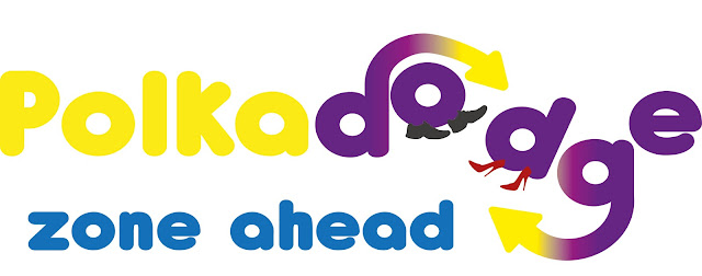
The word I have chosen is “Polkadodge”: the dance two people do when they try to pass each other in the street.

I like this word as it conjures up images of people breaking into dance with complete strangers while just walking to work or doing their shopping.  It makes me think of a more fun place to live, rather than the head down and march society we seem to live in nowadays. I would love for this word to have mainstream usage and claim its place in the dictionary.

My first thought was to run a competition, for people to film themselves doing a polkadodge, and giving a prize to the best dance with an unsuspecting stranger. However, this meant I would be limiting the word to only people ‘in the know’, rather than exposing as many people as possible.


With this in mind, I thought about how to maximise who would hear the word.

Road signs are a classic example of something that millions of people stare at every day, so I looked at how to get polkadodge into a road sign for pedestrians. I researched traditional road signs from the highway code, and looked at how I could introduce a polkadodge sign. The sketches I came up with fit this theme well, but I found them to be too serious  which is not the tone I wanted for my revival of polkadodge.


However, I liked the exposure that road signs get.


To try and keep the sign idea, but inject more fun, I then thought about places with high pedestrian traffic. I love going to music festivals, but getting from stage to stage is always a struggle due to the high volume of people. Music festivals are organic places, which typically try to use natural materials and are usually set in fields and farms.

I decided to make a road sign with a home made feel that is less prescriptive than traditional road signs. I wanted to keep the farm feel so chose a wooden post as my material. I then found a scrap pallet in a fly tipping area which I dried out and ripped apart.


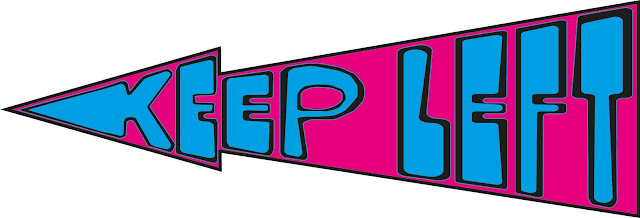
I wanted to make the design of my sign a tongue in cheek warning, asking pedestrians to keep left but if caught out in a polka dodge, pivot in style.


When it came to designing the word ‘polka dodge’, I found a free font online called 'Antipasto'.  I chose this rounded font because I knew I wanted to distort some letters to be dodging each other, going around in a circle. 

Using Adobe Illustrator, I have stretched and altered the letter ‘d’ and ‘g’ of dodge, so that they have arrows moving around each other. I then put shoes on the ‘o’ and second ‘d’ to characterise the two people polkadodging. I’ve used a gradient colour to portray the movement.


I’ve then created a second section ‘KEEP LEFT’ which has again made use of distorting an existing font Phosphate. I have made it unrecognisable from its original form by isolating individual anchor points and stretching them out to follow the shape of the arrow. I had originally attempted to use the envelope distort tool but found that this bent the letters in a way I wasn’t happy with.


The third section ‘if caught out, pivot in style’ used some similar techniques of altering a font called QuimbyGubernatorial, moving anchor points to add loops and swirls into the ends of letters, to be able to then add arrow heads to signify the pivots and turns people take when they Polkadodge.


Once I was happy with these three sections I have printed this onto the wooden planks from the pallet.  I’ve done this printing the design onto paper backwards, then using PVA glue I've stuck this to the wood. Once the glue was dried, I was able to scrape the paper away, leaving the printed design behind on the wood. This has given it a weathered look as some of the ink came off with the paper. 

This effect was really easy to achieve. It lost some quality of the design but I feel that this adds to the authenticity of the sign.

If I were to be using these at a festival as per the idea, I would create multiple different signs along this same theme.  I wouldn’t want exact replicas of this sign because I think again that it adds to the home made element for them to all be different and quirky.


Police Training Booklet


Cyber policing has become a huge issue to todays law enforcement agencies.  And these are not local issues but rather span the globe with multinational crime gangs and technology that far outweighs the police's computers in knowledge and in capability.

I was tasked with planning and co-ordinating a days Continual Professional Development (CPD) for 100 of the most senior detectives within my police force the Greater Manchester Police. 

As part of my efforts to ensure that this was taken seriously and carried as much impact as possible, I pitched and got funding for some professional looking booklets that would accompany the day, giving people information about the speakers, what the talks were about, and a brief CV of the specialists to qualify their expertise.

GMP does have its own in house graphic designers and print house, so I had work with them to produce these excellent booklets. 

Prior to attending at the design studio, I drew out rough sketches of what I wanted to produce. I obviously had a theme of computers and technology and so wanted my design to incorporate that as much as possible. In addition, with it being a police event, blues and blacks were my chosen colours to make it fit with all other official documentation. 

I wanted to make their personal mini CVs to look like they had been pulled out of a filing cabinet, with their name on a tab at the top and the information underneath.  


I sat with the designer as we worked through the booklet, picking out appropriate font, colours and layout. 

The final product is something I am proud of. It may have been the designer who put it together, but it is all based on my ideas and instruction. 

Wednesday 6 January 2016

Penguin canvas paintings


My husband worked 150 miles away from home for 3 years, commuting each Monday to Friday. He lived in a student flat which was totally cold and void of any colour or character. When it came to his birthday, I wanted to give him a gift that he could look at each day to make him laugh.

I quizzed him on his favourite things - hobby, colour, word, band, food, place, memory and animal. Little did he know what he was answering for, so he gave some truthful and some random answers.

This A1 canvas was his present. It is an acrylic painting of all those things mixed in one. The staring role went to his favourite animal - the penguin. Except that its not his favourite...

When trying to work out how to paint a penguin, I spotted a painting online of a stylised blue penguin which I loved. (This was some years ago now before I thought about applying for a design course. I can no longer find it online to reference it sorry.) I based my character on this interpretation.

It was around this central character that I created an image of a film (filmmaking being his favourite hobby) showing all his favourite scenes.

The final result was silly and he loved it. It took pride of place in his room reminding him of his favourite things back at home for him to travel back to each week.

12 months on, I got a request for a second instalment of the series.....


I loved the penguin characters that much, that a year later, I decided to do a second painting, with them still taking the starring role.

This time I opted to show the key memories of the year just gone of things we had done together to remind him of the fun we have.

We were both broke and so travel back and forth to Newcastle had to be done via MegaBus. This was most unenjoyable and it was taking its toll on us both. However, again, the time spent together at the weekends made it worthwhile.

I wanted the cheekiness of the first painting to carry over to this one, and so painted in the exact same style.


12 months on, and the request was raised again.


My husband was out of blank wall space and the thought of him coming home with all these large paintings was daunting! Plus he mentioned that it was a shame they couldn't go to work with him.

So for the final painting for the 3 years, I completed a small 4x3 inch portrait that could sit on his desk at work. To this day, that is where it remains.


The penguin made its final appearance looking majestical and proud.

DIY funky wedding Invitations


For our wedding, I went looking for invitations which matched my husband and I's personalities. I found that most invitations off the shelf were generic, traditional and not to our taste. So I decided to design my own. It was this project that gave me the inspiration to change my career to one of graphic design. These invites are the reason I am applying to university!

The colours of the wedding were purple, pink and orange, so the plan for these invites was to incorporate all those colours into a bright and fun card which would set the tone for what people were to expect.

When looking to design a wedding invitation, Pinterest offered me lots of inspiration for how to make our invitations fun. 

To make these invites, I taught myself how to use Gimp software on my iMac by watching online tutorials and experimentation. I first laid down the background which was meant to look like galaxies of stars.  This involved creating multiple layers on the page so I could get the colouring and shades just to my liking. 

I then downloaded free fonts I found online to add the text. I purposely used multiple different fonts. I love this mixed up and busy page. My favourite font was 'easily amused' which is the one I used for our names. It sums us up perfectly. The inspiration for the text came from multiple similar examples I found from Pinterest such as this one http://weheartit.com/entry/group/33306886

The language I used is purposely young and fun. I didn't like the traditional wording I found on most invitations. Again, I wanted it to reflect the tone of the day, which was far from formal.

In hindsight, I may have altered the colouring slightly as I think the boldness of those that I have used do make it difficult to read the text. Maybe I should have created a greater contrast between the background and the text to alleviate this. 

After I had done the main invitation, I then set about completing a directions card complete with map. I created the map by tracing in one layer over the top of a screenshot of an online real map. Once the real map was removed, the hand drawn map by me was left behind. 

I also made some RSVP cards and thank you cards suing the same style to maintain continuity in my design and make it look professional.

Vista print the did the professional print. 


Jewellery organiser

I've recently finished redecorating my bedroom and I wanted something to display all my jewellery in. I didn't want it all hiding away in boxes and there is too much to put on small jewellery holders.

So my brief was to make something big enough and fitting in with the rest of the room, and I found my inspiration here.

http://www.tonyastaab.com/2011/05/jewelry-organizer.html

So firstly I found myself a cheap type tray on eBay and found this for £8 

I then painted it with some of my favourite colours. The purple compliments the black and purple scheme of the room. 

I added some felt flowers in one corner just as a sweet embellishment, attached with a glue gun.


Earphone pouch

This week, I have made myself a little earphone pouch.

I have an iPhone and I love using it as an MP3. The trouble is that I always get the earphones tangled in my handbag, and spend ages unravelling them, sorting out the knots, or generally looking for them amongst all the other rubbish thats in my bag.

I found this brilliant feature and tutorial by Erin Erickson for her circle zip earbud pouch

I fell in love with this design as soon as I saw it and so set about making it myself.

Here is my finished product;


I've made a few now in a couple of different colours and fabrics, but my friends have already nicked them off me, so they must be OK!

I think this is a great design as it would also be brilliant to use as a little coin purse for car park charges or similar. I've added a keyring so it can easily be attached to your bunch of keys or inside of a handbag. 


Personalised home made iPad and phone covers


One of my hobbies is sewing. These are all examples of things I have sewn for friends and family. 


The designs below were all sewing patterns I made myself. I didn't follow instructions and instead just used trial and error to get the pattern right.


My friend Kim asked for an iPad cover that was padded, simple, funky and blue. This fabric fit the brief perfectly. I personalised it further by putting her K initial on the magnetic close tab. I labeled the inside, like I do with all my sewing, to add an element of professionalism to this handmade gift.


 Below is the one I made for my mum. The only difference is that I used a button instead of a magnetic clasp.  I just love, Love, LOVE the hand embroidered ladies! The blondie is me and the brunette is my mum.


The hand embroidered ladies were two doodles that I often draw at work, and I added these for my mum as it's a mark of how much she means to me. 


I made a matching phone cover as well since she liked the iPad cover so much. Here is the same mini me again.


These are some more that were made on request from friends. In the bottom example, I used appliqué to add the animals to this funky design. This fabric is gorgeous and exciting. One of my favourites to work with.